🎬 #117 More Amazing Movie Posters.
I covered this topic before but there are so many to cover that it’s great to revisit it. There’s a deep, deep art to the movie poster. In many ways they have an almost impossible job. Captivate, in a blink of an eye, and give viewers the sense of the film, beyond who’s in it, without the ability to reveal any plot details in depth.
Happy choosing, happy viewing
Bry
FILM ONE: THE MASTER
2012 Dir Paul Thomas Anderson
2hrs 18 mins
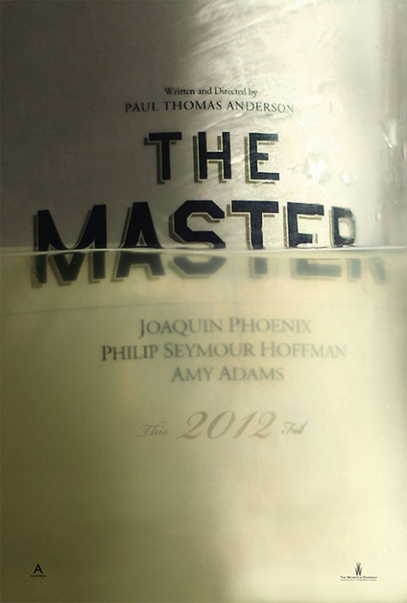
What a poster. What even is it depicting? It’s kind of ambiguous, like the film - but that’s too simple of a comparison. Is it water? Is it the rancid booze that Phoenix’s character makes from torpedo fuel? The one thing that’s clear is that whatever the subject is, it’s in too deep. The quality of the textures, the typography, the thick meniscus of the liquid clinging to the slick metal - all of it spells out a feeling. Intrigue beyond anything else. A period film, maybe. A ship going down, maybe.
Maybe it’s the idea that no one is beyond the ability for liquid to drown - and destroy. The theme of the film is that everyone answers to a Master. No one is immune to power structure, it exists in all forms, even ones you aren’t immediately aware of. And the most powerful ones often appear from within us, deep inside. So deep that we can never be conscious of them. Like a clear liquid licking the edges of our mind.
TL;DR: Paul Thomas Anderson’s film is a document of control, mastery, the truth that freedom is a slippery concept, all perfectly, yet obtusely summed up by the enigmatic poster.
*Available for a small rental fee on Amazon, Google and YouTube in the US and Amazon, Google, Apple and YouTube in the UK.
Fact: Paul Thomas Anderson cut the trailers himself without involving the studio.
FILM TWO: APOLLO 13
1995 Dir Ron Howard
2hrs 20 mins
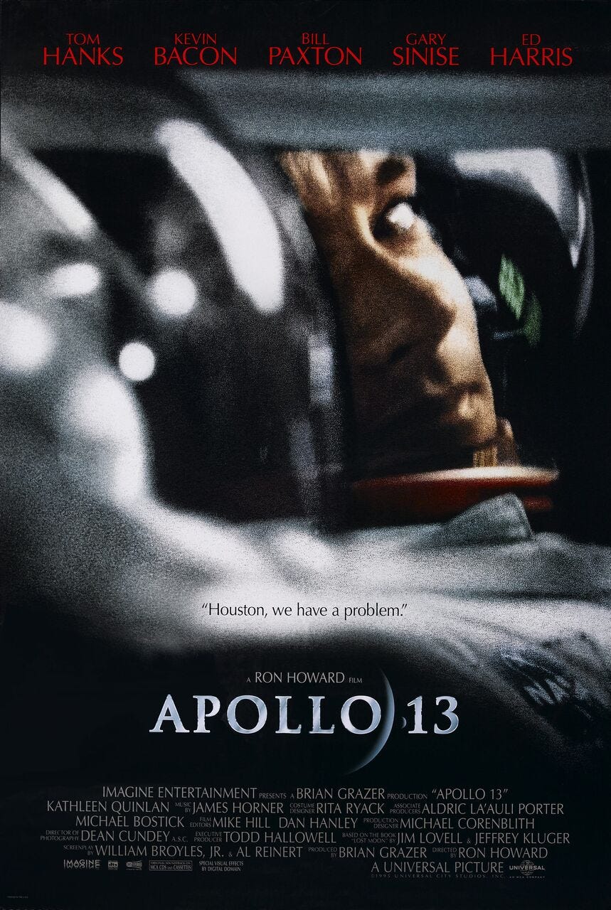
I really love Apollo 13. I remember it as one of those films from my childhood that I could never get bored off, no matter how many times I saw it. There are two main posters for it, which you’ve just seen above. My favourite of which is the second. If the first captures the objectively harrowing, cosmic scale of the issue the astronauts faced. The human drama is captured perfectly in the second. That look of realisation that they’re in the midst of a potentially catastrophic situation with no hope of rescue. The grainy 1970’s look of the image as if a war photographer was on board and captured the look right after they realised that something was terribly wrong. But just before they declared the emergency to Houston.
The humanity peeking out from behind all that glass, metal and kevlar - the precious, thin membrane that keeps the astronauts safe from the vacuum of space. The poster only serves to emphasise just how vulnerable life is, but also, just how strong the human spirit can be when challenged by impossible situations. The second poster also makes the claustrophobic horror of the situation clear, the framing tight, surrounded by darkness and metal - a human-made lifeboat in the pitch black, speckled abyss.
The poster is classically structured just as the film is - names up top, a dramatic but intimate, even understated image in the centre, then credits down bottom. The film would become a touchstone for Ron Howard’s career - his hallmark of turning dramatic real life stories into gut wrenching narratives for the big screen.
TL;DR: Ron Howard’s vitally realistic, yet intimate portrayal of one of the most epic events in spacefaring history is captured perfectly by the poster.
*Available for a small rental fee on Apple, Amazon, Google and YouTube in the US and Amazon and Apple in the UK.
Fact: To simulate the zero gravity sequences, the cast and crew went on 612 flights in a specially adapted NASA aircraft that would ascend and dive in ‘parabolas.’ At the peak of which would create a weightlessness that lasted 23 seconds at a time. By doing 612 flights they managed to shoot about 50 minutes worth of real zero gravity action.


