🎬 #59 A Poster Paints A Thousand Words.
First off, I have to apologise - it’s been a busy time, that’s no excuse - but sadly it means there is only one recommend from me this week. But it’s an absolutely incredible film with an equally excellent poster.
So much goes into marketing films - sometimes multiple times the production budget or at least equal to it is spent on trying to reach an audience. And a huge amount of that burden of getting eyeballs falls on the humble poster or what may now be described as the ‘key image.’ The one image people see that will help convince them to give the film a chance.
Streaming platforms even a/b test these images - more like a film thumbnail [a younger more hard sell version of the humble poster] - to see which image is more alluring to an audience. That’s why you’ll notice the image for say The Social Network change from a close-up of Jesse Eisenberg as Mark Zuckerberg to an image of Brenda Song’s character. They want to know which is more effective at getting you to click.
Speaking of The Social Network - Neil Kellerhouse, David Fincher’s go to designer, designed the poster and accompanying imagery for that film. He also designed one of my favourite posters of all time, for this week’s film.
Happy viewing,
Bry
THE GIRLFRIEND EXPERIENCE
2009 Dir Steven Soderbergh
Soderbergh’s casting of Sasha Grey, a now former adult star, is just the start of what’s interesting about this film.
Firstly, you can see the seeds for Soderbergh’s iPhone shot, High Flying Bird and Unsane aesthetic in this film. Documentary-esque, stylish, clean - unfussy. One of the things I love about his filmmaking is that he’s obviously incredibly well prepared, and exacting, but there’s a sense of lovely casualness about his work - it’s kind of just how it should be - whatever way he sets up a shot or how he chooses to cover the scene, it feels instinctive and not nit-picky.
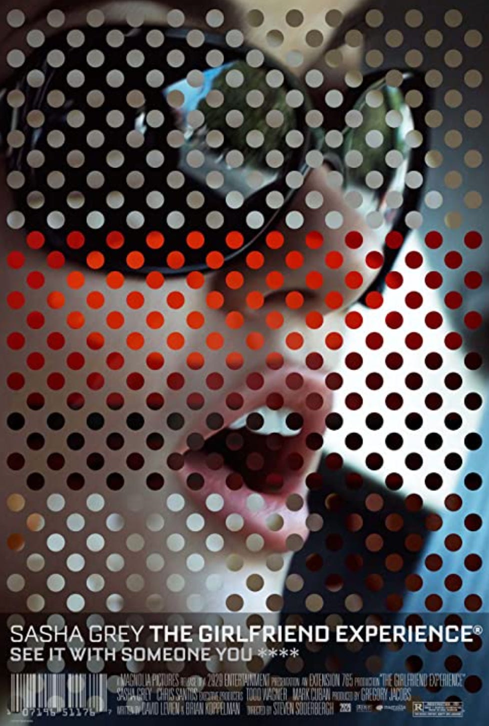
Secondly, he and Kellerhouse produced this amazing poster. Above is the US version of the poster but my favourite is the Japanese version, mainly because everything looks cooler in Katakana, Hiragana and Kanji.
Also, it’s a great poster because it does what all great posters do - they’re a gateway into the film - they crystallise the themes, the style - the idea of the film into a single image - and most of all they’re intriguing, punchy.
The film centres on Christine/Chelsea, played by Grey, who works as a high-end call girl in Manhattan who offers ‘The Girlfriend Experience.’ A simulation of a romantic/sexual relationship based purely on a financial contract. So taking that as the film’s premise - you can see how wonderfully Kellerhouse has weaved his magic.
You can imagine a lot of crass imagery that could be wrongly deployed to sell a film like this but instead they had thoughtful, tasteful people working on it. All you need is the subtlety / suggestion of the open mouth. The oversized, designer sunglasses reflecting her status as someone with means, the overlaid dots a nod to visual censorship, when it comes to explicit material. Now I’m definitely reading too much into this, but the colours selected for the dots are taken from the image itself, they reflect the distillation of something real and 3 dimensional, into something fake and 2D. Her relationships are simulations, they’re flat and 2D.
Take a moment to soak in the wonderful design and then check the film out - I highly recommend browsing Kellerhouse’s other work too.
TL;DR why should I spend 1 hrs 17 mins of my precious life watching this? Soderbergh’s film is a delightfully stylish and provocative watch, that feels real and honest.
*Available for a small rental fee on Apple, Amazon, Google Play and YouTube in the UK.
Fact: Produced for $1.3 million dollars which was partly funded by Mark Cuban, the now billionaire entrepreneur.


