🎬 #75 Short Films In Between TV Shows.
TV channel idents [the branding you see in between shows], when used to their fullest potential can be some of the most powerful and awe inspiring films you’ll see the most repeatedly, even if they last less than a minute. They’ve fascinated me for a long time because they are a unique mix that falls somewhere between narrative short film and experimental art film - they don’t have to tell a story in a traditional sense and yet they can’t be so abstract as to make no sense at all. Their purpose is very singular - remind people what channel they're watching by embodying the personality of that channel - often in a striking and bold way. My interest in these started when I first saw the Martin Lambie-Nairn designed BBC2 idents that ran for 10 years, or more in some regions, between 1991 and 2001. They were playful and interesting, giving a physicality to a number that I thought was pretty cool when I was a kid, I thought ‘it’s not just a graphic on the screen, it’s an object that can do things or have things done to it.’ Made even more interesting by the fact that they made them all practically.
But for me there is one channel in the UK [and their creative team] that consistently makes the best channel branding films ever to have been devised and continue to do so since they started - Channel 4 [& 4 Creative]. That iconic logo was also originally designed by Martin Lambie-Nairn. So this week is me chatting about two versions of the ‘short films’ that they’ve made in the last 8 years, one of which is a new rebrand only just released. I wanted to talk about them because I love them, but also because films and what they can be should be continuously explored and redefined. Even something as short as 30 seconds and is ‘technically’ advertising is certainly worthy of consideration alongside cinema. They teach us an important lesson in abstract thought and image making - the exciting power of a single striking visual that says something and makes us feel something. That is actually a pretty good definition of filmmaking to me.
Happy viewing
Bry
FILM ONE: CHANNEL 4 IDENTS
2015 Dir Jonathan Glazer
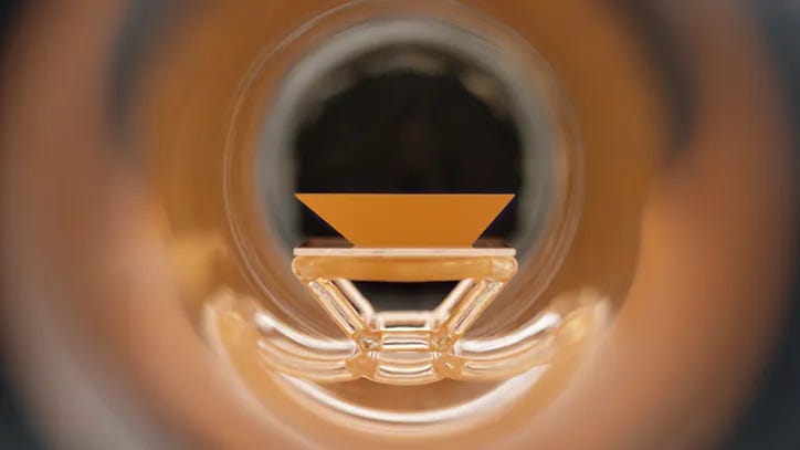
What I loved about this approach was that they deconstructed the iconic Channel 4 logo [seen below]. Exploding it apart in the graphic motion elements and then taking one step further in the films themselves - not featuring a 4 at all. Which, I think, is a first for any TV branding. Instead they created a series of scenarios that feature the physical elements that make up the logo as elemental parts of nature. Something that exists in the world, as real and precious as a gem or metal - but as mystical and unknown as dark matter.
Each film is handled with Glazer’s unique gaze - somewhere between objective documentary and strikingly stylish narrative filmmaking. Breaking things down into stoic, unflinchingly beautiful imagery. All the films build up to the reveal a full narrative. It goes something like; exploration reveals this mystical geometric formation, the formation is mined and refined, the shapes are subjected to scientific examination and we get a glimpse of how they form a kind of ceremonial worship that could be ancient or contemporary. The texture of the cinematography, the casual feeling but ultimately precise handling of the framing, and the sound design and score by Mica Levi leave us with a dark, beautiful, otherworldly series of films that totally embody the philosophy of Channel 4, a brave, bold, risky place.
TL;DR Channel 4 and Jonathan Glazer’s exercise in branding is, pound per pound, as powerful and interesting as filmmaking can get in between tv shows.
*Available as a compilation here on YouTube for free.
FILM TWO: CHANNEL 4 IDENTS
2023 Dir Daniel Wolfe
Saman Aminzadeh
Optical Arts
Bafic
Mike Battcock
Will Dohrn
Daniel Eatock
Mike Skrgatic and James Allen
Verity May Lane
Maria Lax
The Line
Louis McCourt
Justyna Obasi
Elliott Power
The Romantix
Dan Tobin Smith
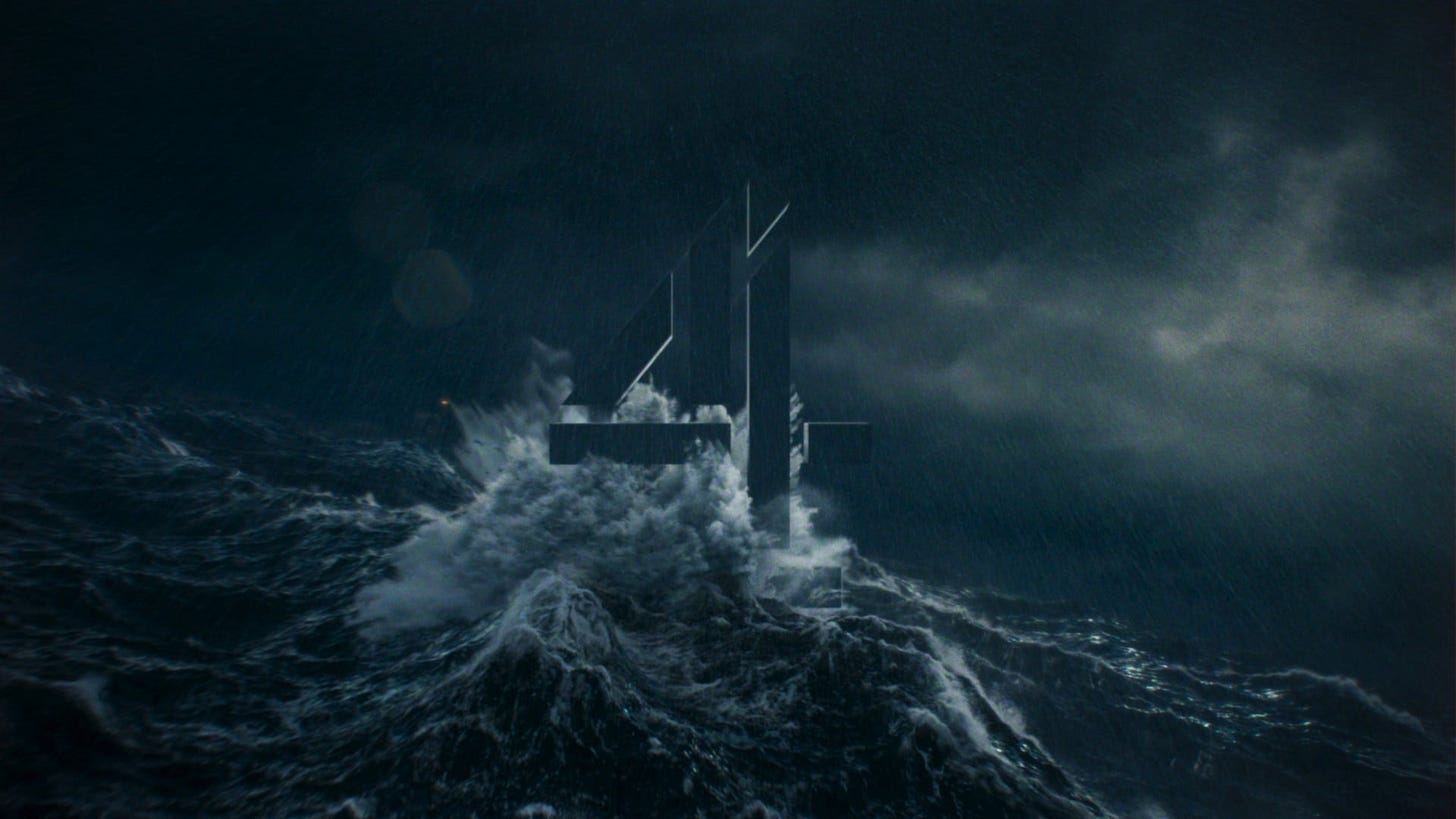
This new set of films takes the Channel 4 logo and puts it back together. The striking series of endlessly looping films place the logo in 25 different scenarios that paints a vivid contextual picture of the channel. The kinds of things the channel makes in terms of tone but also the kind of audience they have and the kind of place the UK is.
As you can see from the director/artist list, each film was crafted by a different filmmaker, as opposed to the singularity of Glazer’s approach. In this way, they are all different but still the same, representing the diverse palette of the channel itself through each filmmaker’s unique vision.
They sit somewhere between the previous series of idents I spoke about and the stunning perspective shifting version from 2007. They firmly place the logo at the centre while making it embody and inhabit a universe that defies one simple explanation. The use of the continuous loop means that there is a overwhelming, cinematic satisfaction that puts guard rails on the vision in a compelling, practical way. A lovely piece of filmmaking that will endlessly deliver over the years.
TL;DR Enjoy Channel 4’s latest branding films in a way you would a piece of motion art.
*Available for free here.


